Reporting 2.0 dives into much more detail about your TourBuilder virtual tour's performance on your website and everywhere else it's embedded.
To access TourBuilder reporting follow these steps:
- Log in to the TourBuilder Insights dashboard using your credentials*
- Select My Tours from the left-side menu
- Pick the tour you would like to look at
- Click on the Reporting tab from the top menu options
*If you do not have a login, contact the client success team and we will create a login for you.
The reporting feature is broken down into 5 sections.
- Select and Compare Date ranges
- Heat Map
- Channel & Device Source
- Visits By City with Visit Duration
- Menu Clicks
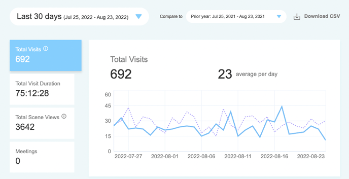
Select and Compare Date Ranges
In the first section of reporting, users can select and compare date ranges to measure performance over selected periods of time. The current version allows comparing total visits, visit duration, and total scene views. Hover over the graph to see the selected metric for any given day.
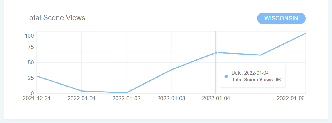
Heat Map
The heat map gives you the ability to track the local source of your virtual tour visits, scene views, and duration within the United States. To view more granular locality metrics, select your date range and a metric (Total Visits, Total Visit Duration, or Total Scene Views) at the top and click on a state.
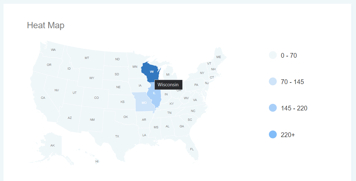
This will display performance for your specified metric in that state.
Channel & Device Source
Leasing and marketing teams can now track the source of visits and views as well as the visit duration on their tours by Website, Direct, or Other (social media, paid ads, etc).
Website - this metric means the tour was visited while embedded on a website.
Direct - means the tour was visited with the tour direct link and not iframed on any website.
Others - tracks any other pages the tour was visited on such as social media or an ILS (Apartments.com, Zillow, Zumper, etc.).
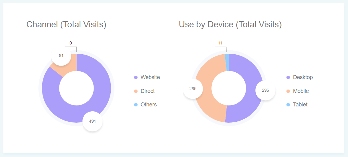
Users can also track what devices their virtual tour traffic is coming from, such as Desktop, Mobile, or Tablet. This gives marketers a clear picture of how prospects are viewing their digital content online.
To view all 3 metrics (visits, views, and visit duration) of either pie chart, hover over the graphic.
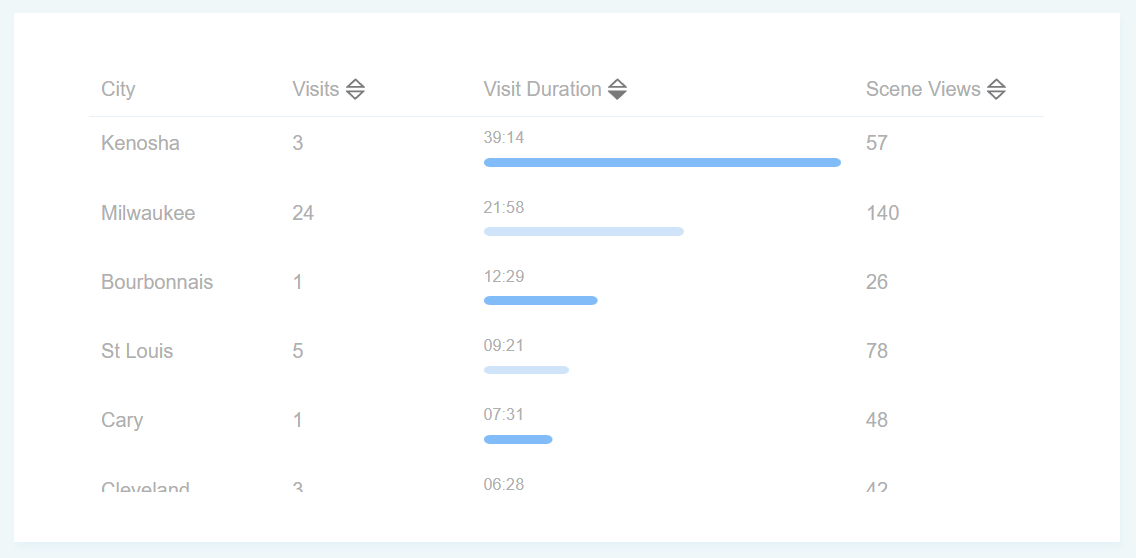
Visits By City with Visit Duration
Similar to the heat map, Reporting 2.0 also gives a breakdown of visits, visit duration, and scene views by city. For communities that may have a lot of out-of-town traffic, this can be incredibly helpful to know what major cities are attracting leads to your website.
This report can be sorted by using the arrows next to the 3 metrics. You can either look at this based on which cities had the most visits, the longest visit duration, or the most scenes viewed.
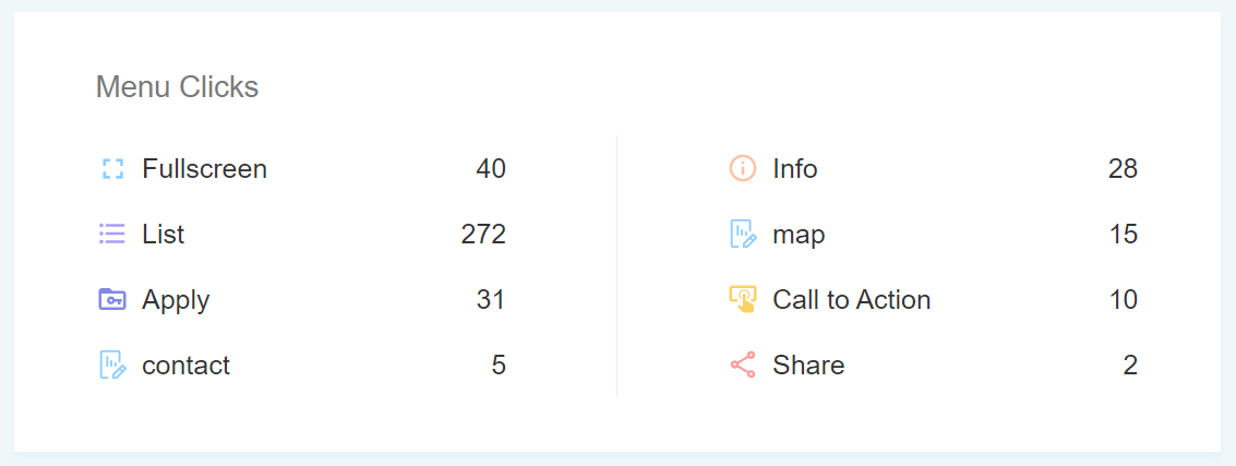
Menu Clicks
The last section of reporting breaks down how many clicks each menu option received. The List option is a custom button that can be created for your property such as a floor plan selector or amenities breakdown based on your industry. The call to action is a customizable button that can be labeled based on your industry as well, such as "lease now", "book a room", or "find a doctor".
All of the menu buttons have customizable options which can be updated by our client care team.
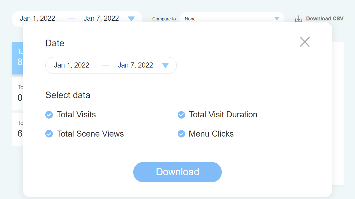
All of the data can also be downloaded into a CSV file, where you can select the date range of the download as well as the metrics you want.